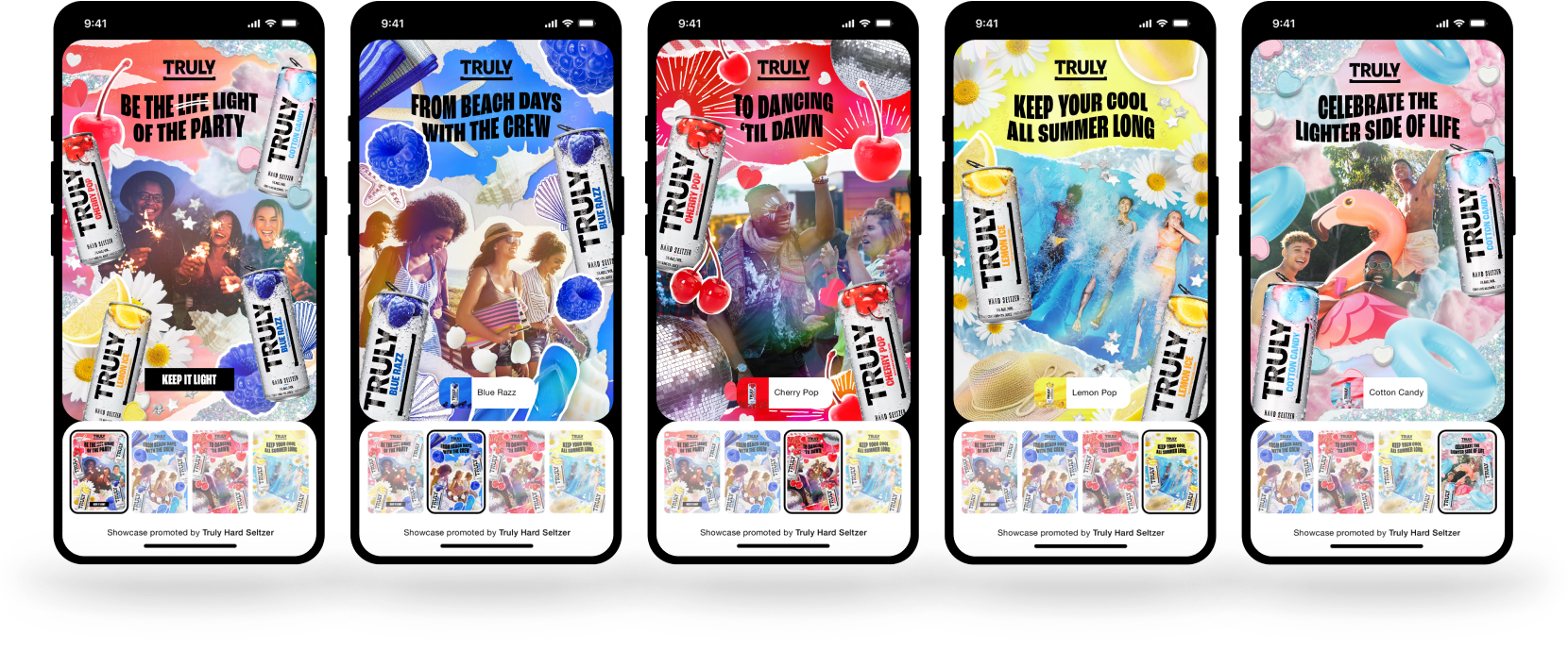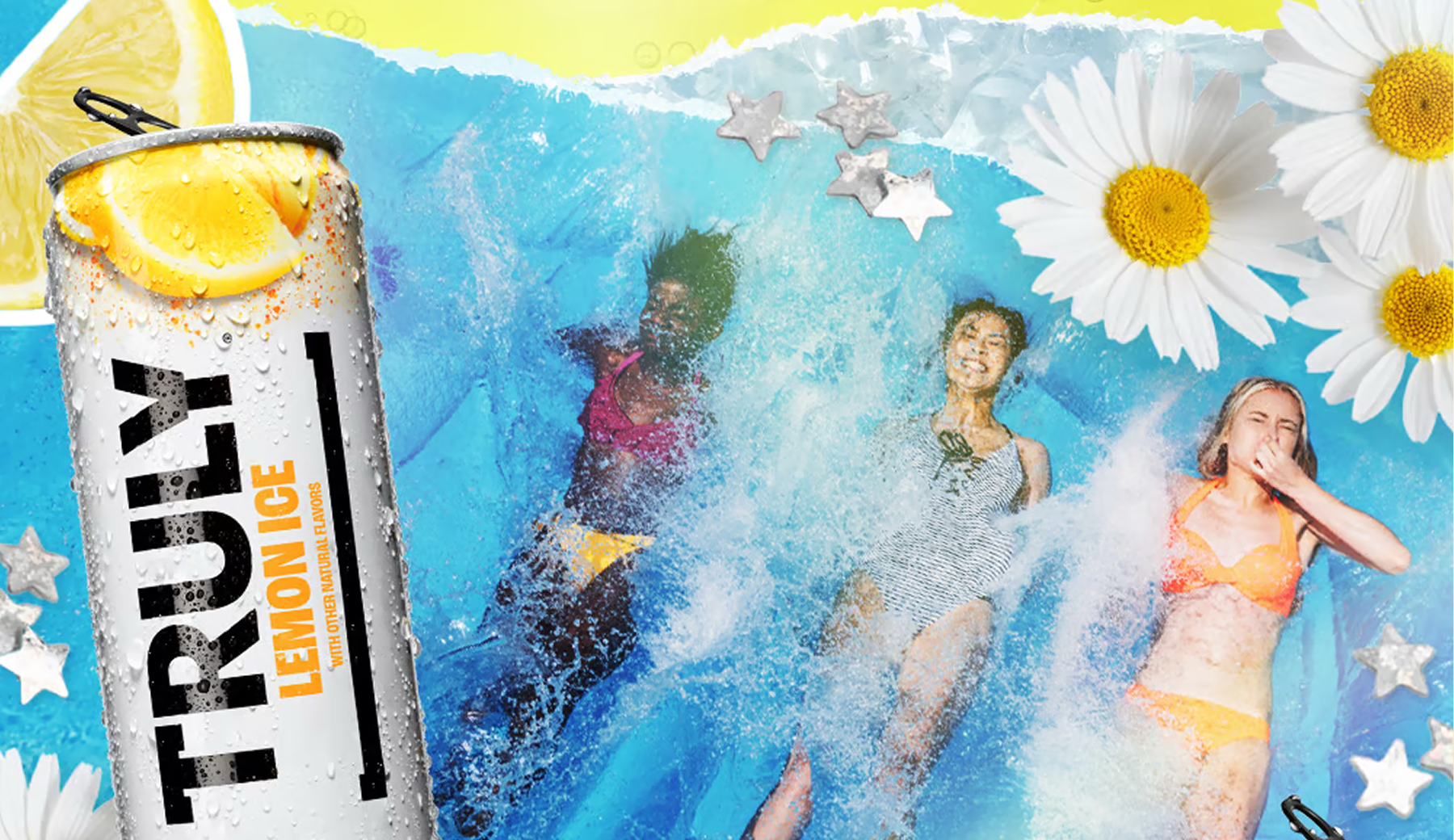
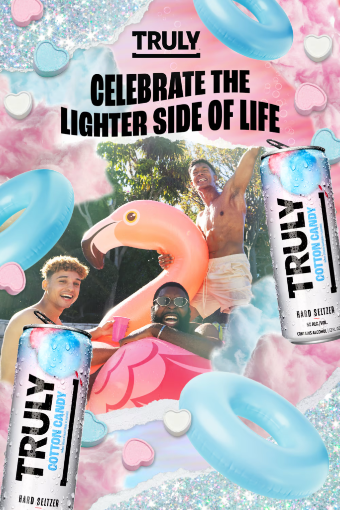
With a candid, effortless brand personality, Truly Hard Seltzer was a natural fit for the collage format. With only product shots supplied, the overall visual direction was led entirely from our side. The ask was to highlight each Truly flavour with a heavy emphasis on the summer/refreshing messaging from their brand campaign, while also communicating their “keep it light” selling point in a visual way (ie. bubbles).
Moodboarding
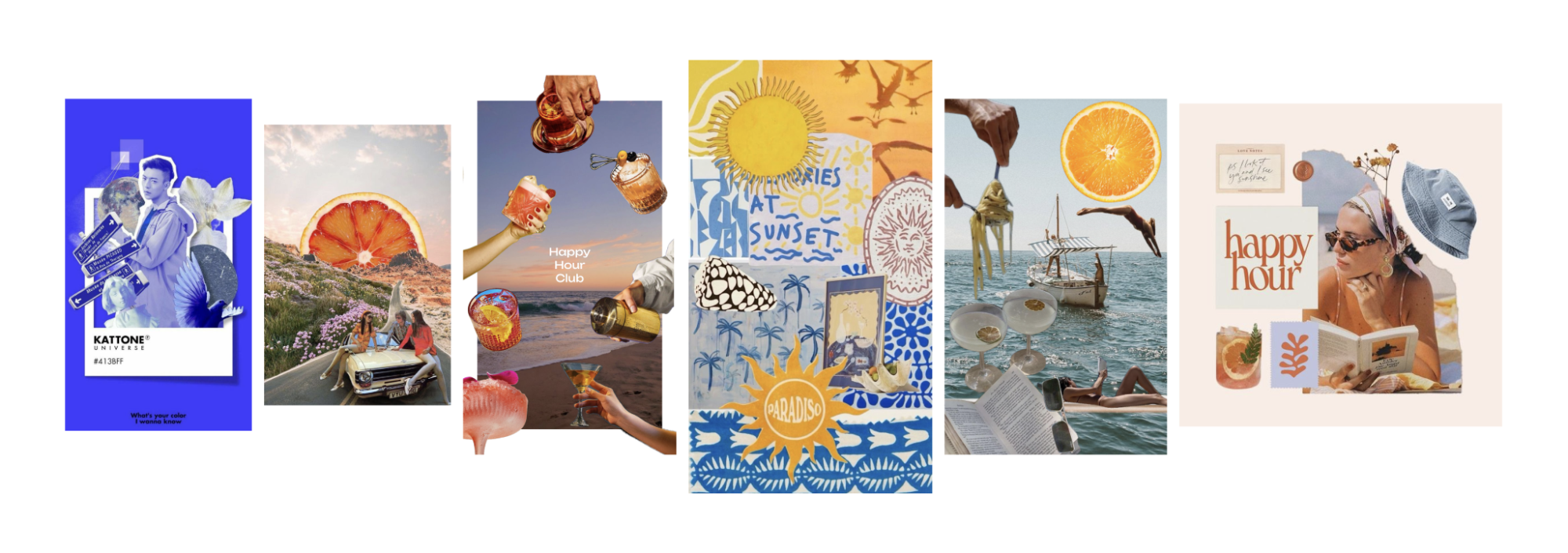
As a starting point, I pulled some collage references from Pinterest featuring summer imagery and cohesive colour schemes. My plan was to visually distinguish each collage with the use of colour, incorporating flavour cues which align with each product.
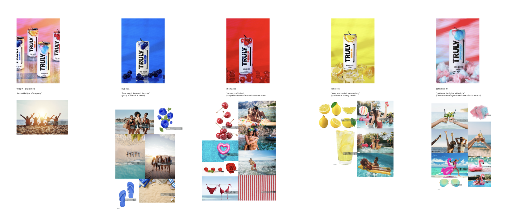
Pinterest showcase ads operate like a carousel, in this case with a title pin featuring multiple SKUs, and the following pins featuring an individual product each with a UI overlay button linking to shop it. My initial plan was to build out the individual product pins first, then incorporate elements from each into the title pin so it acted as an intro/summary to the set.
Final Assets
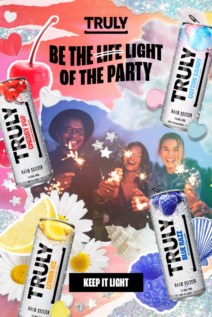
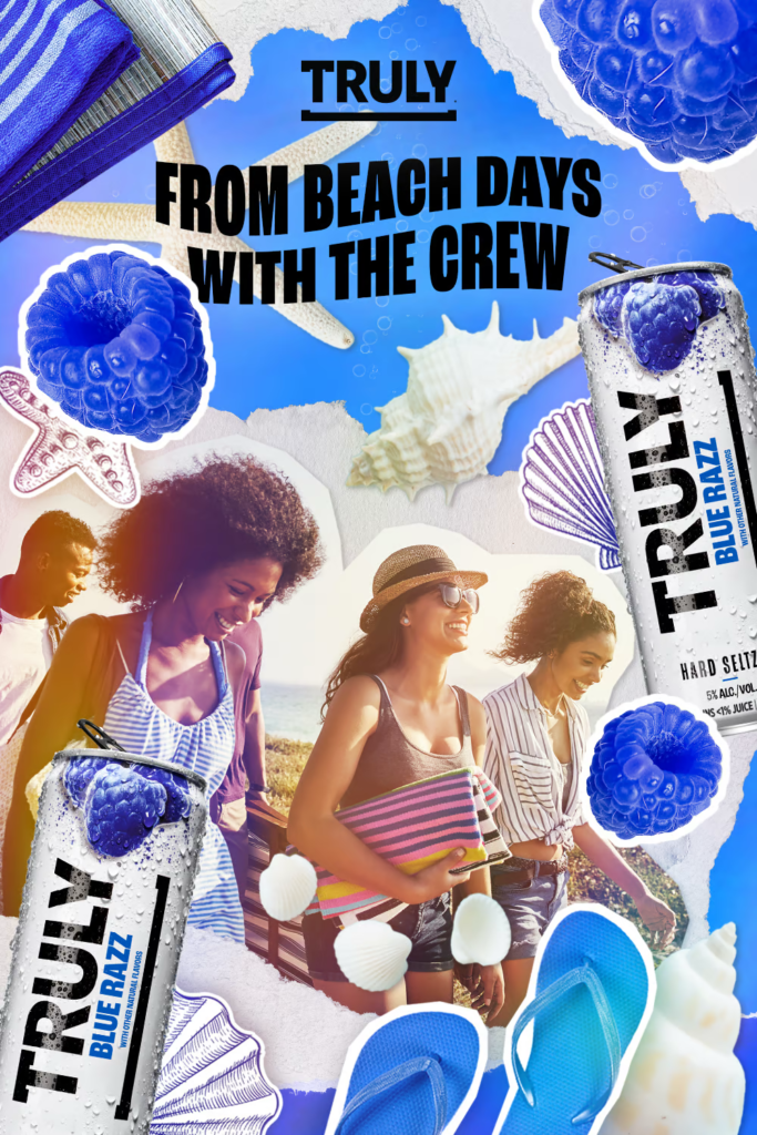
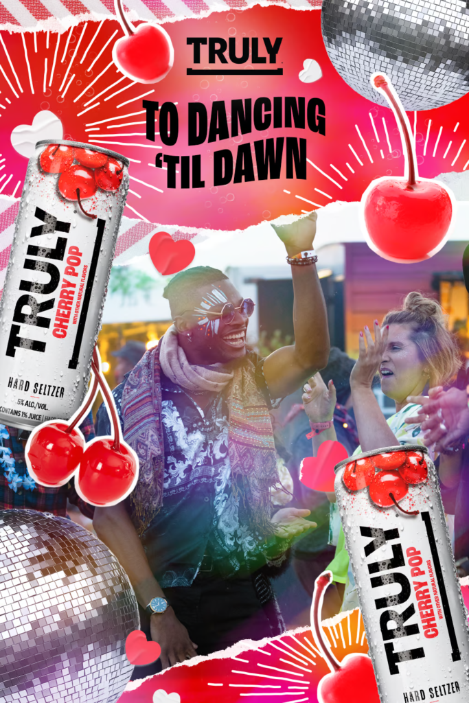
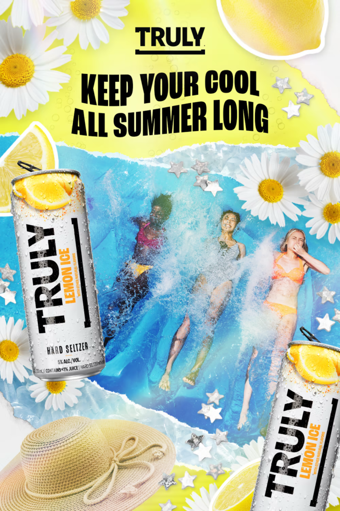
Click to expand.
Drawing inspiration from each flavour, I developed a colour scheme and sourced imagery for each collage, using repetition, varying scale, and layered textures to create a set of ads that felt light, fun, and unpolished in exactly the right way. To ensure we met the brief, bubbles were incorporated in a subtle way behind each headline, adding to the effervescent “keep it light” mood.
Feedback was light, with one of the only comments being to pivot the Cherry Pop pin from featuring a couple on holiday (as seen in the moodboard) to a more festival/friends focus, contributing to the addition of the disco balls. This project lead to further work for Truly Hard Seltzer, creating video assets inspired by the look and feel of these collages.
In-Situ