As acting Creative Lead on the Workday account at OLS, I was responsible for directing and reviewing a high volume of creative for the EMEA and APJ markets. Initially, work was primarily demand generation content, however this soon expanded into a variety of projects including event collateral, large-format print, publication design, image sourcing, video editing, and brand guardianship.
Having a high attention to detail, working at a fast pace, and being aware of cultural nuance were all essential parts of this role, as was maintaining a positive working relationship with the client. After Workday’s new branding was introduced, we became brand guardians – pushing back on requests that broke the new guidelines, and ensuring a smooth transition to the new design style.
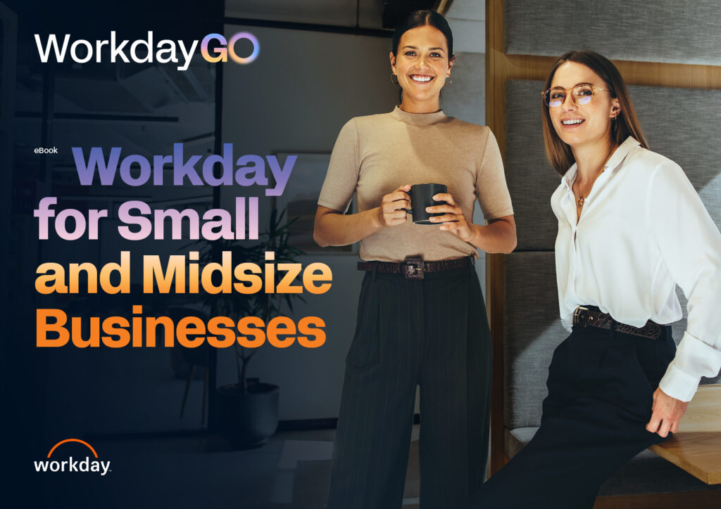
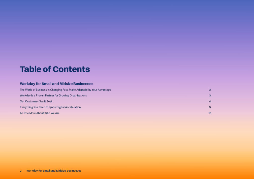
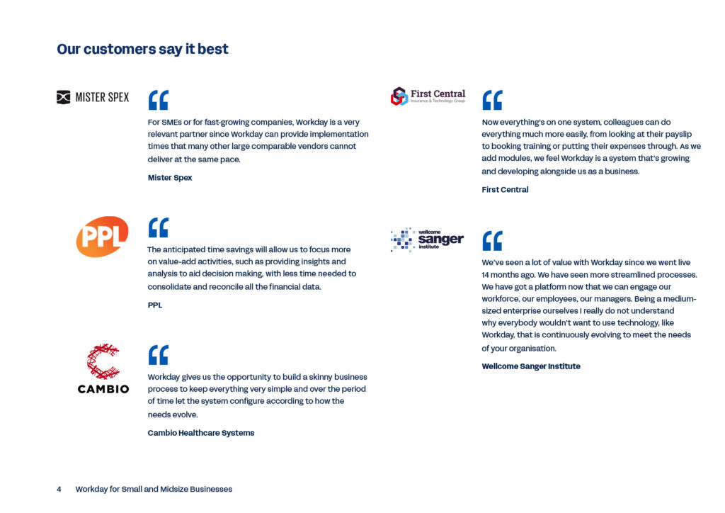
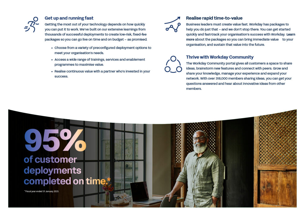
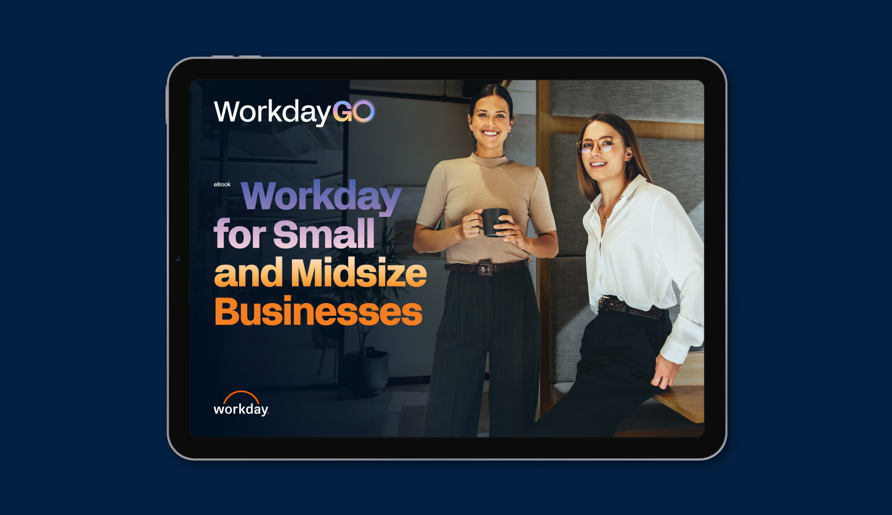
Since Workday’s worldwide rebrand in late 2024, we’ve been tasked with redesigning a number of eBooks to align them with the new brand guidelines. This involved ensuring image selections, type, colours, gradients, icons, and layouts all fit the new brand guidelines and meticulous reviewing to ensure there were no errors or discrepancies in the publications.
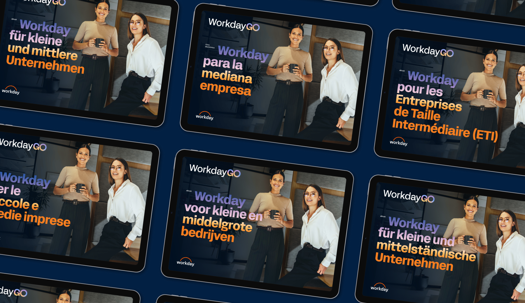
Following approval, these publications are often localised for various markets. In this specific EMEA example, Workday for Small and Midsize Businesses, we created localised versions for Belgium, France, Germany, Italy, The Netherlands, Scandinavia, South Africa, Spain, and Switzerland.
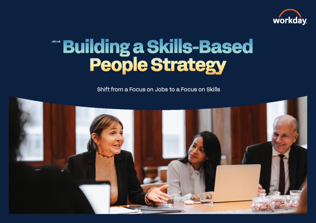
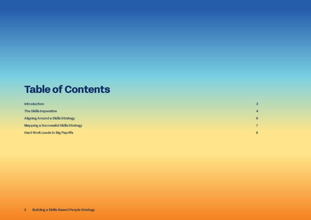
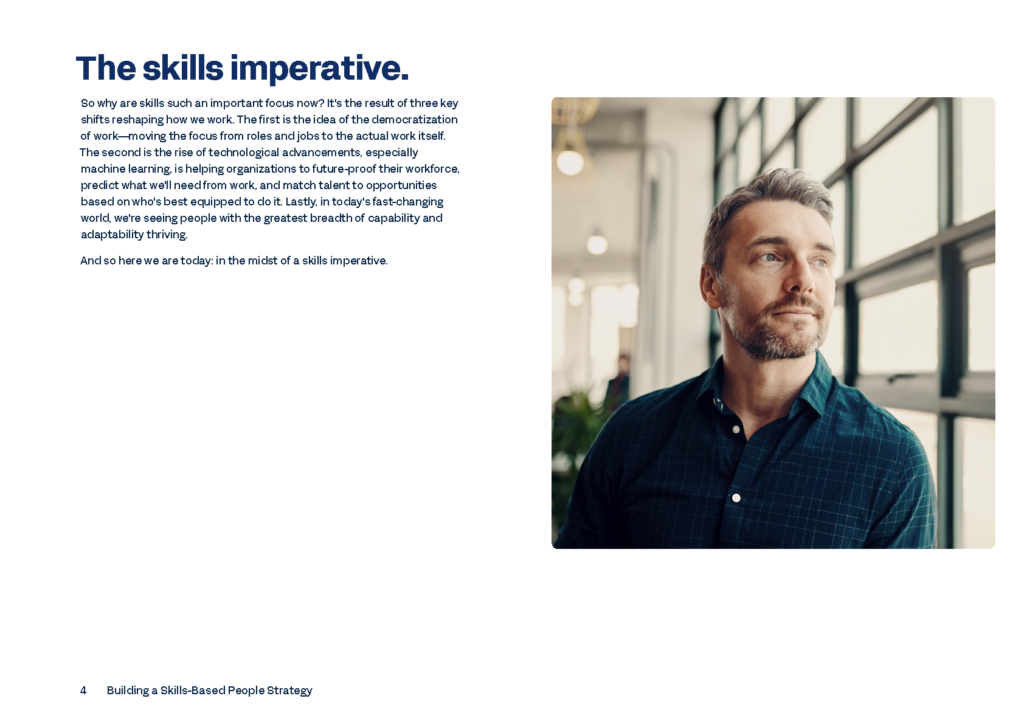
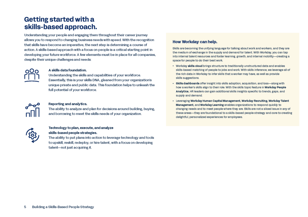
eBooks for the APJ (Asia-Pacific and Japan) market feature slightly different considerations than for EMEA, as the localisation process also includes swapping imagery out to suit regional demographics. The example above was initially created for Australia and New Zealand, and subsequently localised for Singapore.